🤘🏽 🇵🇸 ✡️ ✝️ ☪️ 🕉️ ☸️ 🏳️🌈 ♾️ 🕊️
I’m a graphic designer and type designer with a research-based, process-driven and artistic approach.
Depending on the project, I work independently or in collaboration with designers, studios and other specialists.
I’m especially interested in projects where people genuinely care about what they’re doing.
Quick Access/Download:
☞ Portfolio.pdf [40mb]
Graphic Design:
☞ Visual Identities & Systems$—$$$
☞ Logos/Wordmarks & Lettering$—$$$
☞ Editorial & Web Design $—$$$
☞ Design for Special Occasions$—$$$
Type Design:
☞ Retail Typefaces$$—$$$$ ♡
☞ Semi-Custom Typefaces $—$$ ♡
☞ Custom Typefaces$$—$$$$ ♡
☞ Language & Script Extensions $—$$
☞ Font Engineering $—$$
Please get in touch with more information about your project :)
☞
✉️ 📯
— Wordmark —
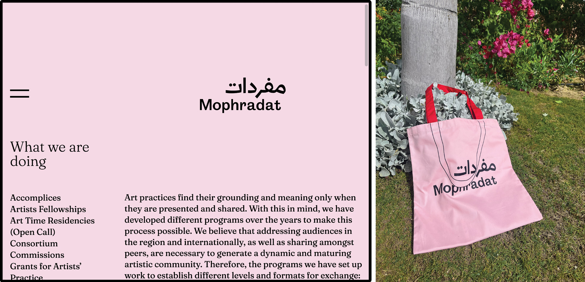
Wordmark Development + Consultancy for Mophradat Foundation, MGMT Design Studio (NYC), together with Shahd El-Sabbagh
— Campaign Identity —
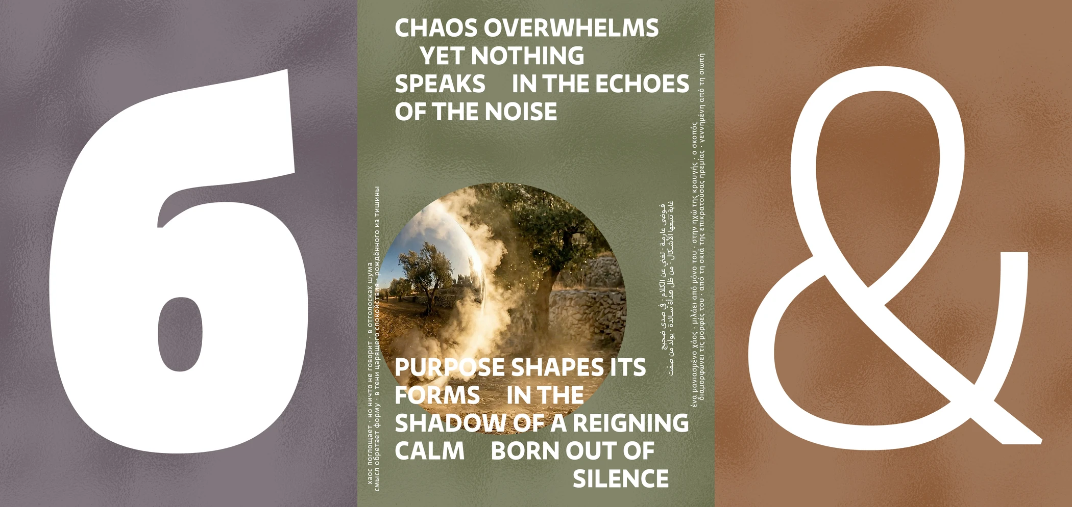
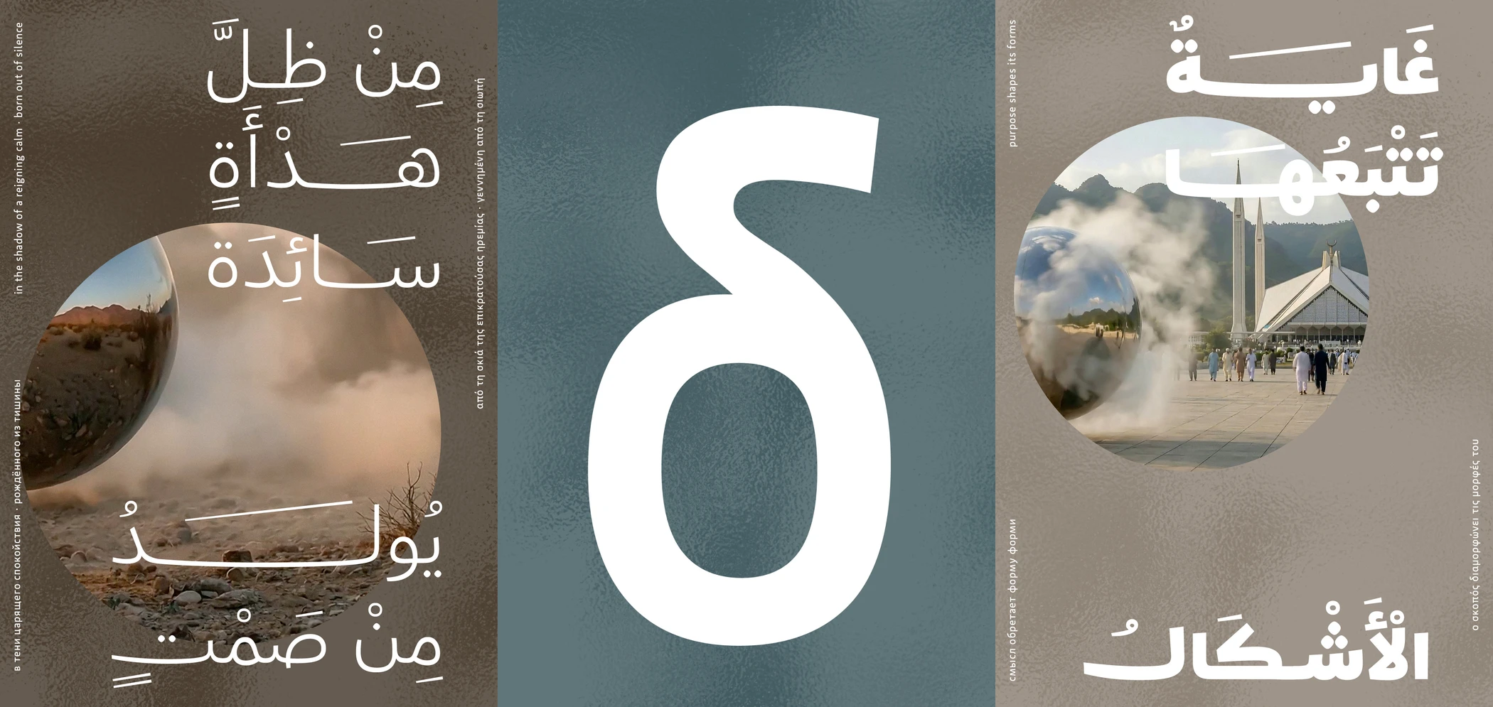
Poster Series for Fontwerk, Campagin to promote the Sukoon typeface family by Jan ‘Yanone’ Gerner. 🔗
— Editorial Design —
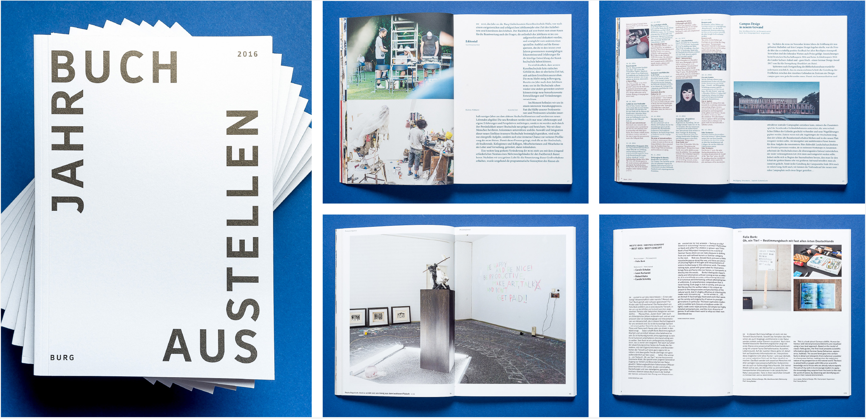
Year Book for the Burg Giebichenstein University with Patrick Müßiggang, 2016/17
— Custom Display + Semi-Custom Body Text Typeface —
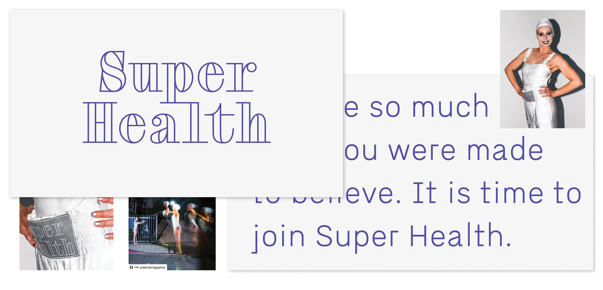
Custom Typeface System for Super Health, a conceptional fashion label by the fashion designer and visual artist Alexandra Börner.
— Type Design + Font Engineering —
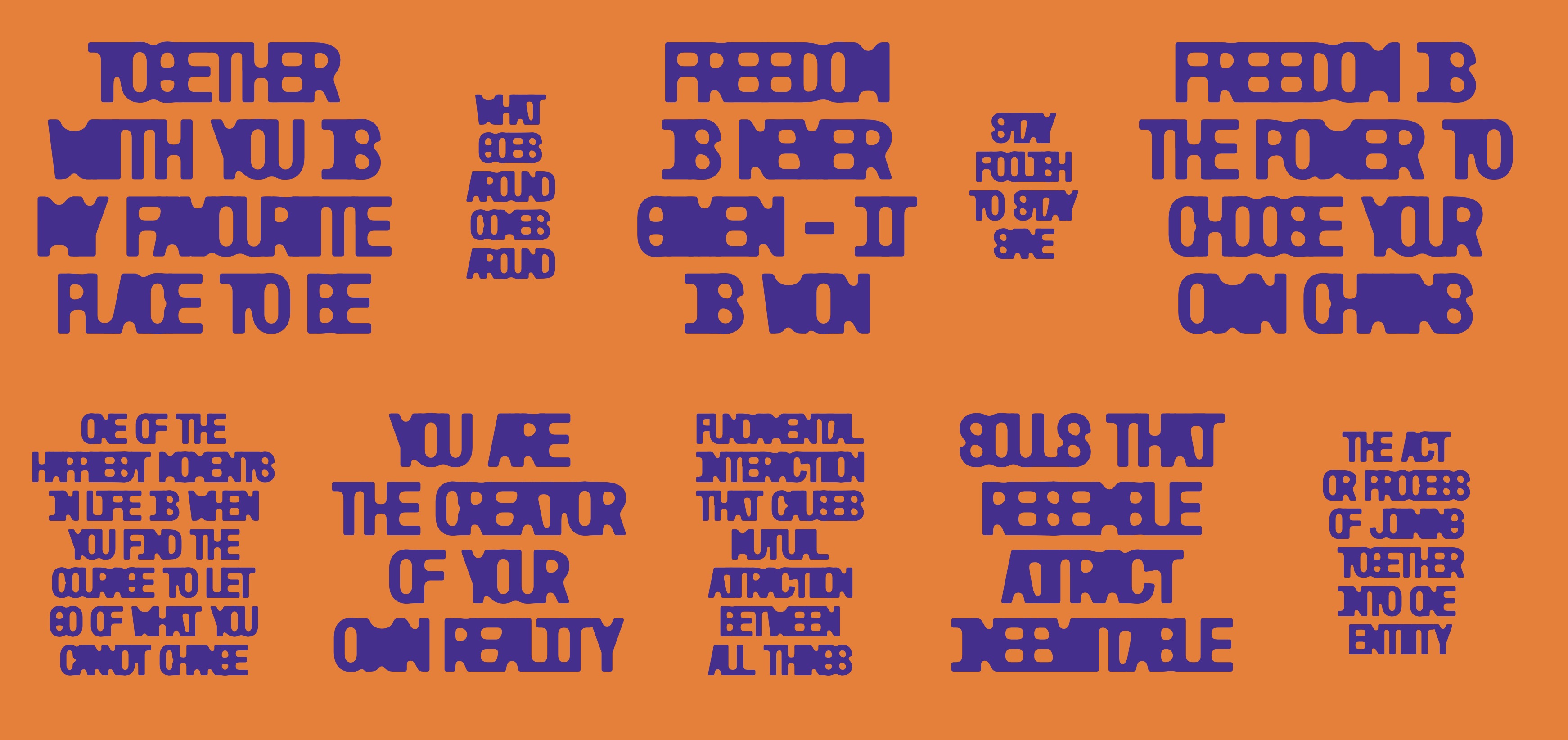
Confusa Typeface, Ceci Erlich, F37 🔗
– typeface development based on letterings by Cecilia Erlich
– together with Rodrigo Fuenzalida (F37)
— Retail Type Design —
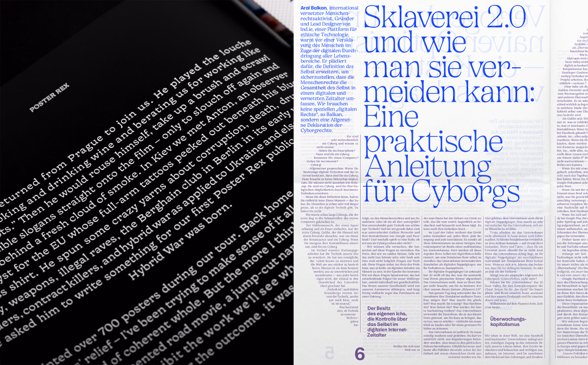
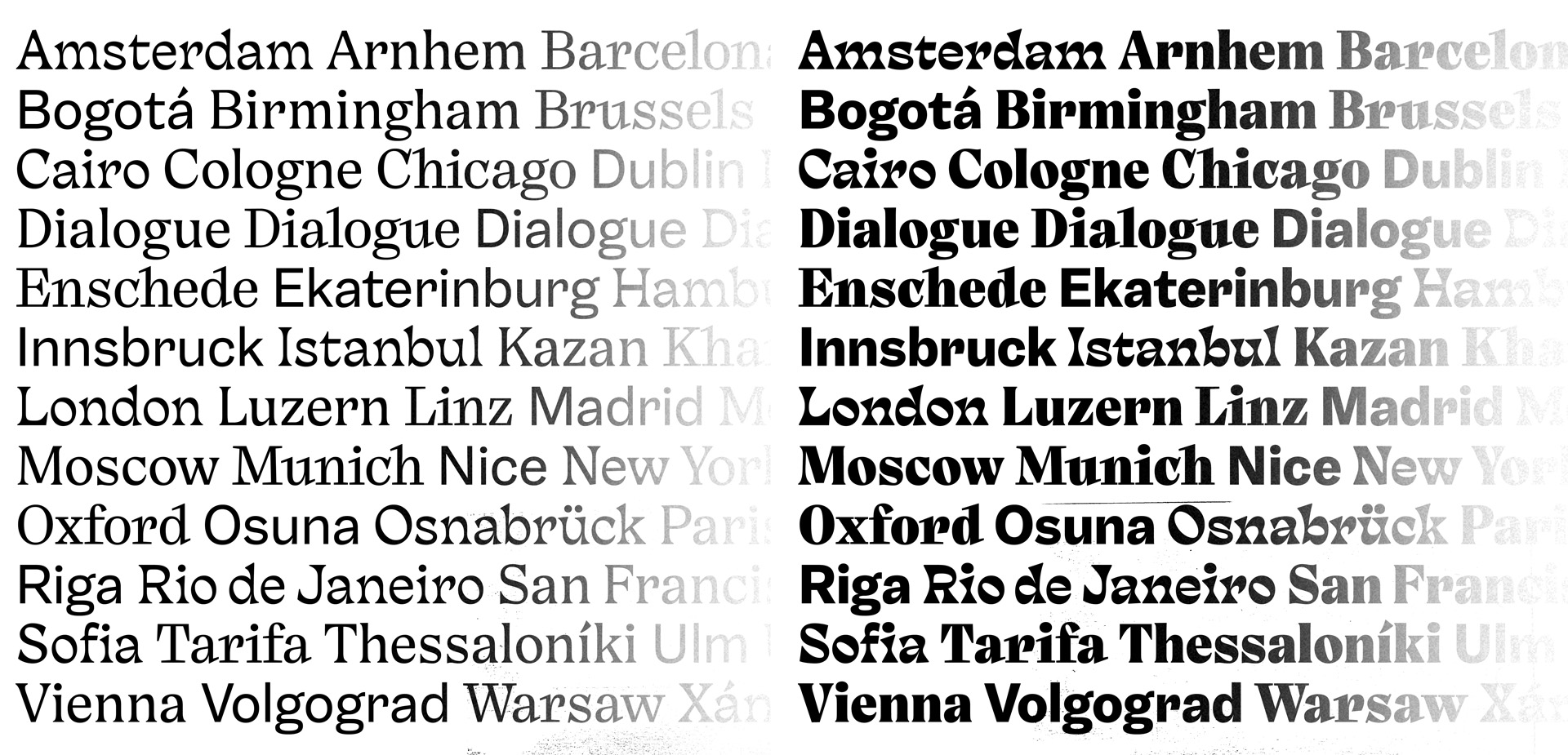
Dialogue Collection is an unconventional project of four intertwined typeface families: Sound, Calm, Fierce and Prime. They are especially crafted to suite the artistic and functional needs of contemporary cultural publications across different media. Another key feature is their versatility due the many ways you can mix the distinct styles that have been developed to complement one another. The project started as a part of my master thesis in 2015/16 in Reading, UK.
[In-Use / photo on top right]
→ Get a free printed copy of the large-scale KSB Magazine (DE)
Beautiful Typography by Bureau Est ; issue 31, 32, 33 & 34. (shipping excluded)
[2026: Finished, going to be published via Fontwerk, Berlin]
→ Request early Access:
— Custom Type Design —


Superfamily for Chelsea FC, F37 + Uncommon
🔗
– with Ryan Hellyer Williamson, Alfonso García, Rodrigo Fuenzalida,
– Shaqa Bovand, Roman Tronchin
– Creative Direction: Rick Banks & Uncommon Agency
– I contributed mainly to the core design X-Sharp and also Flare
— Custom Type Design —


Display Family for MotoGP, F37 + Pentagram 🔗
– with Ryan Hellyer Williamson
– Creative Direction: Rick Banks & Pentagram London
— Brand System—

Visual Identity for Megalomania, a sustainable product label
– Photos by Patrick Müßiggang
— Webdesign —
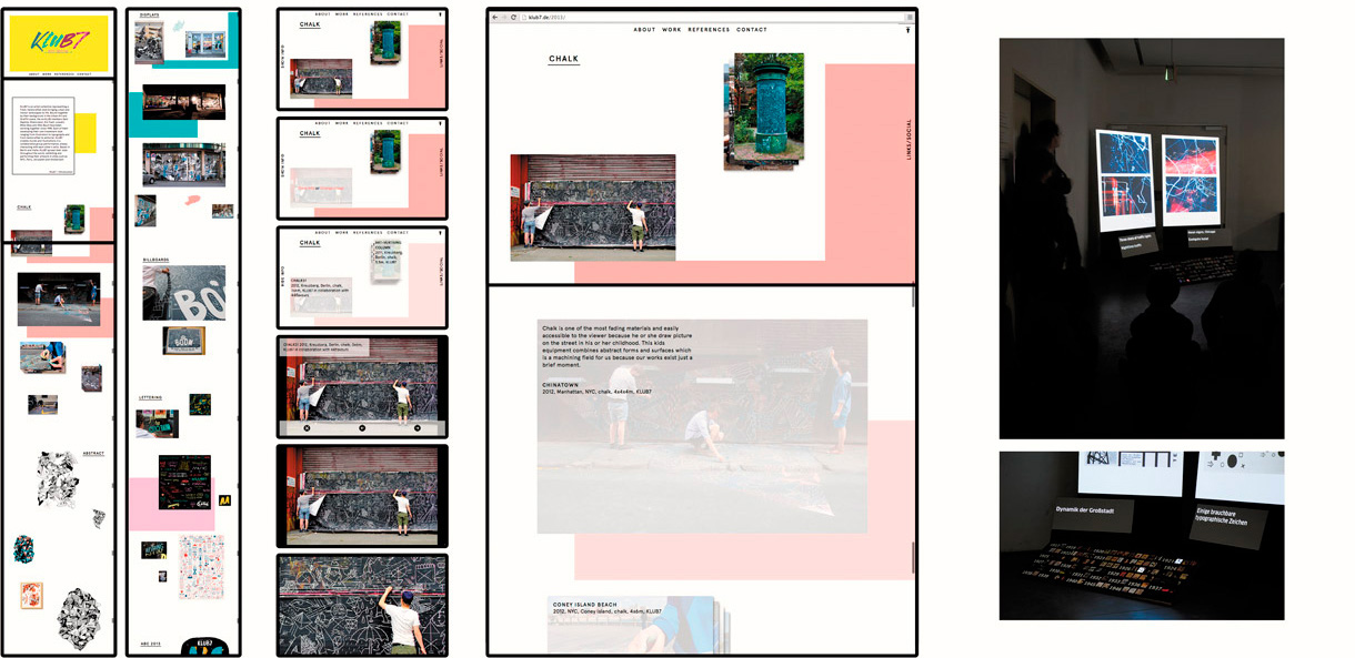
Webdesign and Code for the Art Collective Klub7 with Markus Lange, 2014 + Portable Exhibition System with Patrick Müßiggang and Lukas Adolphi, 2011
— Research —

Variables of Type is a systematic investigation into all visual aspects of type. This involves analysing many diverse and complex scripts such as Latin, Chinese, Devanagari and Arabic — to find underlying global principles and relationships. The aim of this project is to come up with a flexible system that could describe any writing system in detail. While many scripts are represented, it is still most excessivley visualised in Latin. Work in progress since 2013.

— Cairo Type Collective —
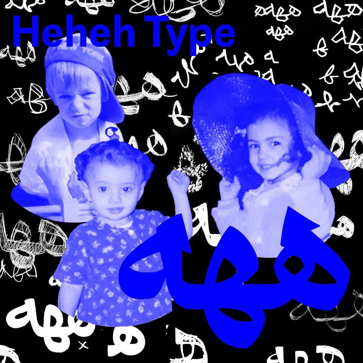
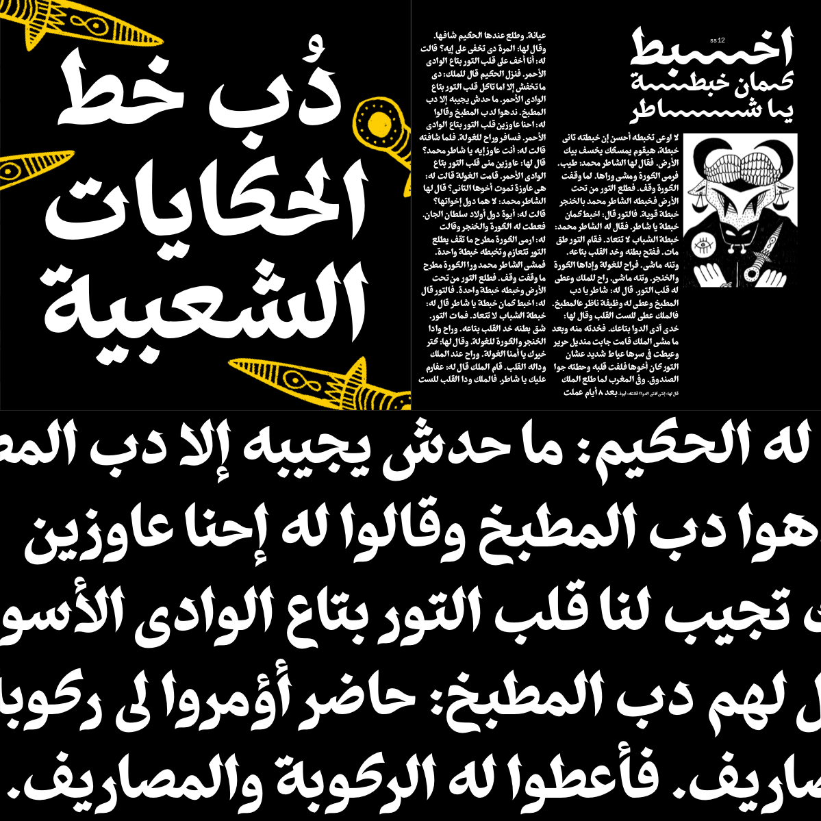

Heheh Collective is an Arabic design collective based in Cairo. It was founded in February 2020 by Nour El Shamy, Shahd El Sabbagh and Manuel von Gebhardi. Get your hands on Dobb and Gawhar distributed via the lovely platform: Future Fonts.
— Retail Typeface, Arabic Extension —

Bolton Arabic for F37 🔗
– with Shaqa Bovand (F37)
– More on the F37 Foundry Website
— Teaching Type in Cairo —
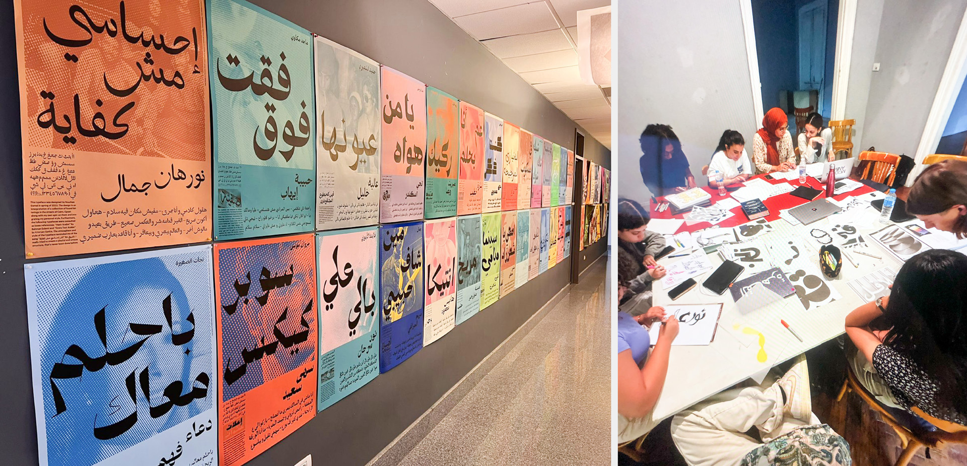
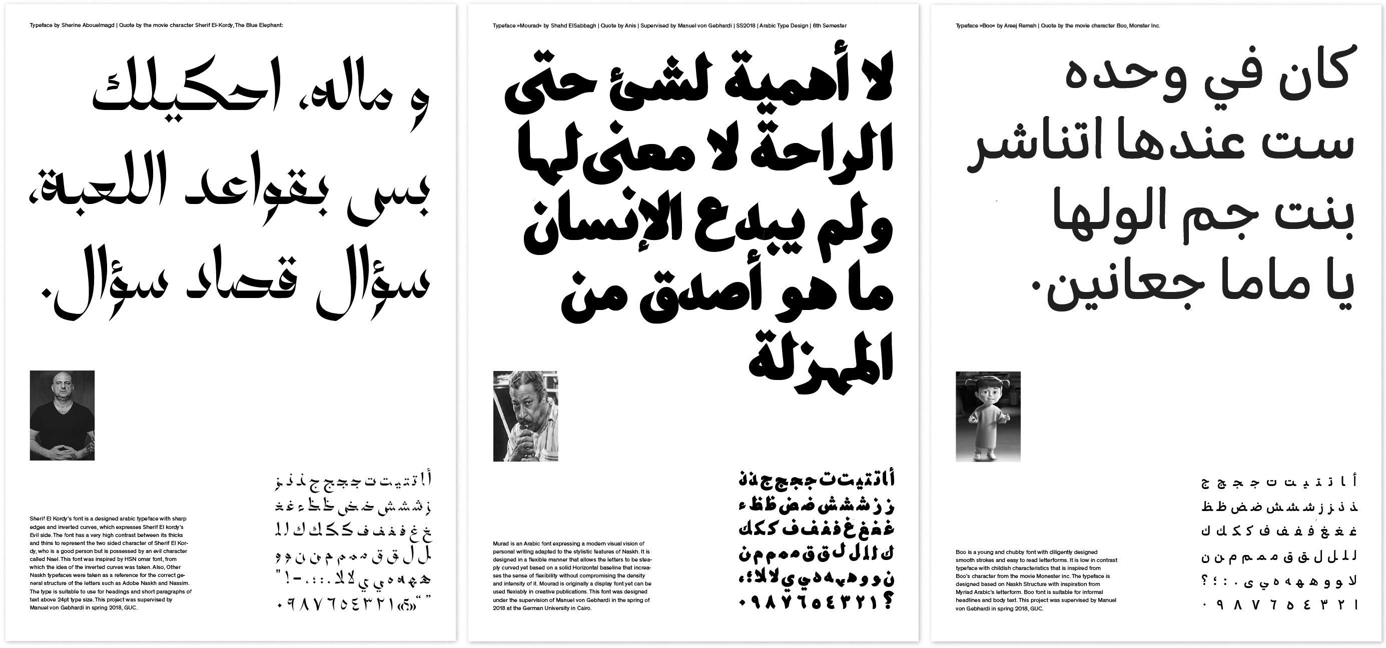
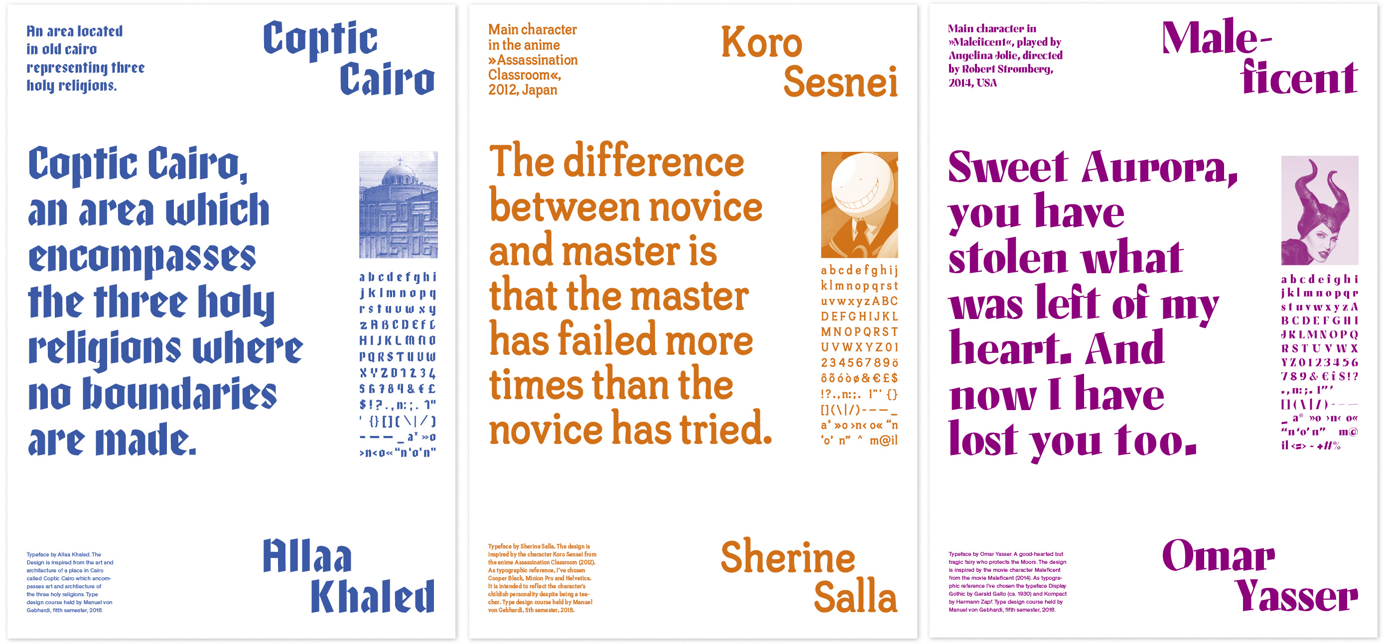
I had the pleasure in teaching Latin & Arabic Type Design, Typography and Foundations from 2017 to 2024 at the German University in Cairo. I teached from 3rd to 10th semester, with up to 140 students per semester. Over the years I redeveloped the entire type design program. I teached together with the wonderful Kholoud Khaled Essawy.
— Special Occasions —
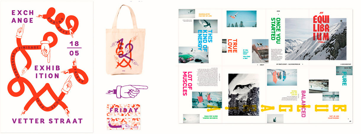
Event identity for an exhibition in Amsterdam, 2012 + Leaflet/Poster for an independent snowboard movie, 2011
— Commissioned Research/Experiments —
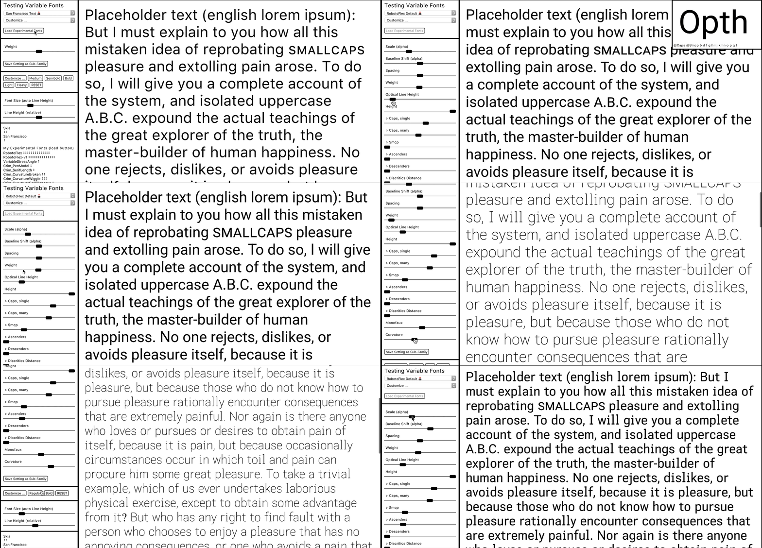
Variable Type Research/Experiments for Google Fonts (Github Repo), 2016/17
— Research / Experiments —
Experimental parametric (hierarchical interpolation) type design and custom interpolation plugin/script in Glyphs 1, 2014
— Visual Identity + Customized Font —

Playful identity and bi-annual sub-identities for an international gathering of art and design students in Halle, 2012—13
— Background —
Besides my love for typography and design, I'm interested in a broad spectrum of things – such as philosophy, psychology, sustainability, craftsmanship, theatre and dancing; I taught type design and graphic design at the German University in Cairo (2017—2024); MA with distinction in typeface design from the University of Reading (UK); received my BA in Graphic Design from the Burg Giebichenstein University of Art and Design(2014) in Halle; and studied at the Gerrit Rietveld Academy in Amsterdam (2012). I'm very grateful to have learned from Andrea Tinnes, Roman Wilhelm, Dan Reynolds, Radim Peško, Gerard Unger and Gerry Leonidas. My very first font was a grafitti inspired all caps design, made with the genuine Freehand & Fontlab in 2005. It’s too good to be shown (-;
Let's create something special together.
Looking forward to meet you:
— Social & Co —
☞ instagram: Manuel.vonGebhardi
☞ mastodon: @manuel@typo.social
☞ twitter: ManuelvGebhardi
☞ github: manuel87
— Typefaces Used —
☞ Prime Regular (Dialogue Collection) — pre‑release access
☞ Sound Regular (Dialogue Collection) — pre‑release access
☞ Lyon Italic — by Kai Bernau, Commercial Type